
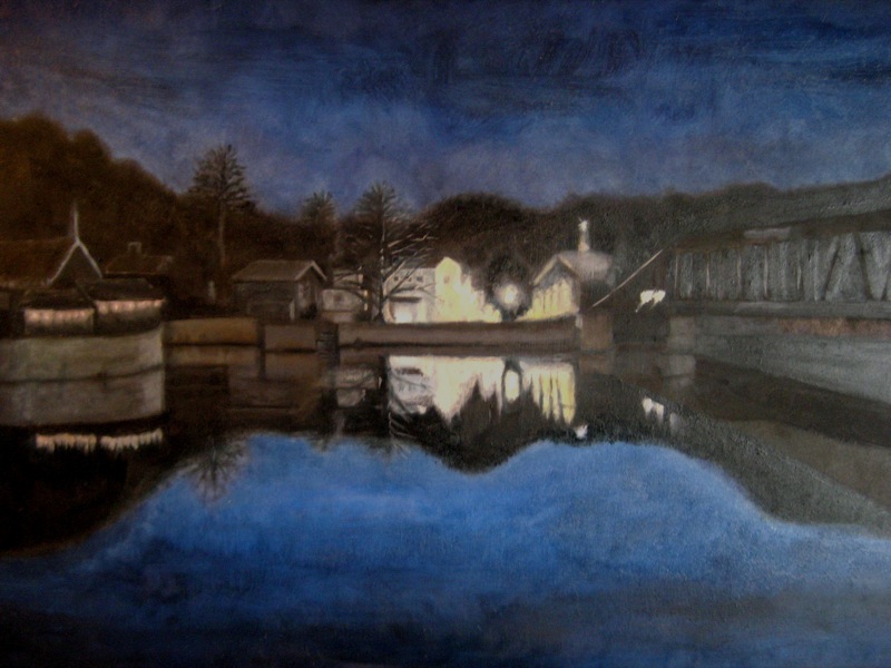
I started this painting with the intention of breaking two conventions that I've pretty much stuck to as a painter. The first- I find that most of my paintings can be too tight, and I wanted to try loosening up. The second convention is that I don't paint landscapes. I decided to try this one after being inspired by a painting I saw at a gallery called No.108 Front Street of HuangJiaoPing by Li Qiang. It has a beautiful sense of light, and although largely abstracted still creates a great sense of space.
The goal then, for this painting: Loose landscape with a sense of space and light.
The light reminded me of a photo I'd taken of Stockton, New Jersey from across the shore of the Delaware river in New Hope, Pennsylvania (not to far from where Washington crossed, as a matter of fact). I used that as a base for the painting, but in an effort to work 'looser', I abandoned the photo pretty quickly (the original is here).
The biggest change from the photograph came when I decided that the main street of Stockton needed a glowing ball of light in the center of it. To me, the painting all of a sudden became about some mysterious event in the dark of night. Later, a little happy accident gave me the idea to put a shadowy figure - almost unnoticeable under the big tree on the left side of the painting. So now there's a story. I don't what the story is, but it's there.
I quite like the result. Its nothing like the painting - or the photograph that inspired it.
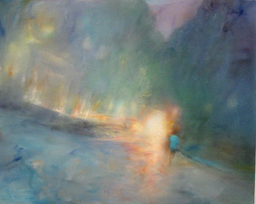
Here is a detail of the painting:

Here is a detail of the painting:
8 comments:
Wow! That is impressive. How long did it take you? How big is the painting? May I suggest for the non-thumbnail image (the one you get to when you click on it) that you go for a larger size?
Excellent use of light.
I have a few painter friends - how would you feel about my sharing this blog with them?
Thanks guys! I appreciate the positive feedback to get me motivated with the blog.
@olman- I've been working on it for a little over a week I guess, but with school and everything, I have no idea how much actual time i've put into it. I don't have a tape measure here, but i guess its about 18" x "24. That's a great point about the resolution, ill definitely upload a higher quality pic today.
@lantz- sure! so far its just family and the 'kraft, but everyone is welcome. The more feedback the better!
very cool. it's very different from the others I have seen. Is the resistance to landscapes about a resistance to the literal?
Thanks, and no- not to the literal- i really like painting portraits. I guess its a resistance to scenery. When I've thought about painting a landscape before, in my mind I always think of it as painting something like a postcard- in other words, pretty to look at but without much meaning.
...and that's not to say that there aren't landscape paintings that i love (Thomas Cole's series Course of Empire are some of my favorite paintings of all time). More abstract landscapes I've loved as well (like the one mentioned in the post)- and kim and i saw an amazing series when we were in canada a few years ago of landscape prints made by using ink and rusting metal as plates.
I just meant to say that when I've sit down to decide what sorts of painting i want to work on, i've rarely considered landscape.
Very cool painting! I love your subtle use of colour, despite the darkness of the scene.
So good......
Post a Comment